
You got
| time | - | (health ÷ 10) | = | score | |
| 100 | - | (50 ÷ 10) | = | 127 |
3 scores max per player; No foul language, show respect for other players, etc.
Name | Score | Date | ||
|---|---|---|---|---|
| 1 | ||||
| 2 | ||||
| 3 | ||||
| 4 | ||||
| 5 | ||||
| 6 | ||||
| 7 | ||||
| 8 | ||||
| 9 | ||||
| 10 |
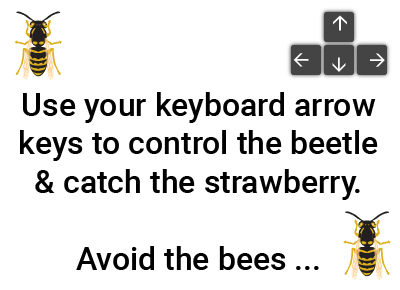
Game: THE BEETLE AND THE BEE
Aim: Collect the strawberries, avoid the bees
Method:
Move the beetle with the arrow keys or by tapping the screen. When the beetle catches the strawberry, you must answer the question. If you get it right you keep the strawberry and earn points.
Your final score is based on the time taken minus health lost divided by 10.

anonymous
"Words to decimal numbers"
The beetle and the bee game to practice
'Polarity, strength of correlation' for 7th grade
7th grade / Statistics / Two variables / Scatter graphs / Polarity, strength of correlation
Polarity and strength of correlation for scatter graphs
Scatter graphs use dots or diagonal crosses to represent values that correlate the relationship between two variables. The scatter graph will indicate the degree to which the two variables are correlated (linked or related).
For instance, a scatter graph plotting altitude (x-axis) against Oxygen concentration (y-axis) will indicate a strong correlation between these two variables because Oxygen concentration reduces with altitude (the reason climbers can suffer from altitude sickness). On the other hand, a scatter graph plotting eye colour against exam results will show no correlation because these two variables have no causal relationship.
The polarity of a correlation can be characterised as "positive" or "negative". This indicates whether an imaginary straight line drawn through the points (a line of best fit) rises to the right (positive - as the x-axis variable increases, so does the variable on the y-axis) or falls to the right (negative - as the x-axis value increases, the y-axis variable decreases). So, thinking about our example of altitude plotted against Oxygen concentration, we will see a negative correlation because the concentration decreases as the altitude increases. A positive correlation would be seen if we plotted a child's age against shoe size: as their age increases, so does their shoe size.
The strength of a correlation can be characterised as "strong" or "weak". A strong correlation will be indicated on a scatter graph by points that closely follow a line of best fit. A weak correlation will show points that are more loosely concentrated around a line of best fit.
In this topic you are asked to decide which of the descriptions provided best describe the correlation between the variables plotted on the x and y axes. The possible options are:
- Strong positive correlation
- Strong negative correlation
- Weak positive correlation
- Weak negative correlation
- No correlation
With our The beetle and the bee math game you will be practicing the topic "Polarity, strength of correlation" from 7th grade / Statistics / Two variables / Two variables. The math in this game consists of 16 questions that ask you to identify the polarity and strength of any linear correlation for each of the given scatter graphs.
Fast moving interactive game to learn math where you control the beetle and the bee moves randomly about the screen. The bee should be avoided and the strawberries collected by answering math questions from the topic you have selected - this is learning math for fun!
Notes
- Fast moving game with character control via keyboard arrows.
- Suitable for tablets and mobiles by tapping the direction you want the beetle to go.
- Learn or revise your math and win strawberries for your beetle!
- On the second set of 5 levels there are 2 bees to avoid...
- It's a fun game, but it can be hard to get through to the end!
UXO * Duck shoot * The frog flies * Pong * Cat and mouse * The beetle and the bee
Rock fall * Four in a row * Sow grow * Choose or lose * Mix and match
Latest leaderboard entries: Beetle & bee


How to play The beetle and the bee to practice
'Polarity, strength of correlation' for 7th grade

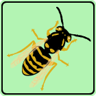
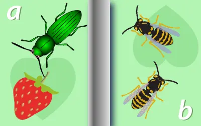
The beetle is hungry and sees the tasty strawberry but the angry bee wants to sting it...
- Choose "The beetle and the bee" from the games selection page.
- When you start the game you are in the first level of a simple maze.
- You are the beetle and you want to eat the strawberry but there is a bee who will try to sting you.
- Each time the bee stings you, you lose a little of your life.
- Use your keyboard's arrows or tap the screen to move the beetle.
- Move the beetle around the obstacles avoiding the bee and get to the strawberry.
- When you catch a strawberry, you will get a math question from your selected topic.
- Select or enter the correct answer.
- If you are right you win the strawberry - now you must get back to the swirly "portal" at the top right of the screen.
- Entering the portal takes you to the next level of the maze.
- The game gets harder after the first 5 levels - now there are 2 bees trying to sting you...
- You need to complete all the levels without dying of bee stings to win.
- Your final score is your time taken minus your remaining health divided by 10.


